Clearer, more searchable and a homepage with more to choose from: the Delta website has been updated in line with user experiences over the first few months.
What can you expect?
- Better tagging and linking
- Easier to navigate
- Improved search engine
- Five stories of the day
- More articles on homepage
We started the new Delta website this summer, during the OWee. Since then, we have been experimenting with writing stories about TU Delft and its community, using tools from constructive journalism, as we had previously announced that we would do.
At the same time the Delta team has focussed much more than before on reaching out to students and employees on social media, especially Facebook and LinkedIn, and with a revamped newsletter.
We have also listened closely to our users to find out how we could improve the website in a meaningful way, trying to work agile like a start-up. With their input, we had the internet agency we work with, TamTam, design and roll out a new release that is now live.
We are confident that with improvements in tagging and linking, the website has become easier to navigate and thus clearer. We have also improved our search engine to search not only headlines and intros, but also body texts and author names. And the homepage now has more to offer than the five ‘stories of the day’ that we have been displaying every day over the last couple of months. We will keep using the ‘Spotlight’ feature with five stories no student or employee should miss, but we now also show the other most recent stories further down the homepage.
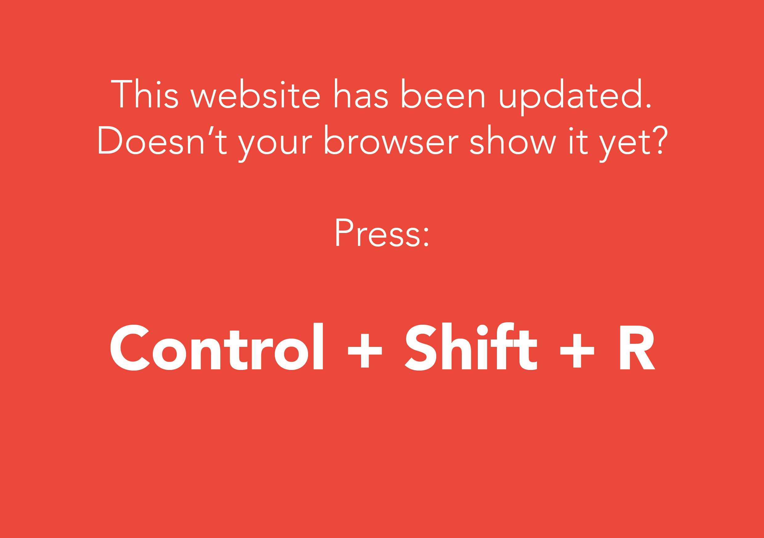
You may have to use a ‘hard refresh’ to have your browser show the new homepage right away – simply please press Control + Shift + R. We hope you like our updated website and please let us know if you have any suggestions, because working agile means new updates will no doubt follow!
Also read:


Comments are closed.