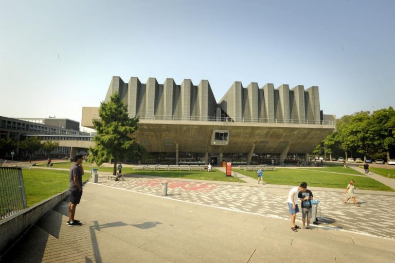
Why does the Aula look like a massive squatting frog? In this series on urbanism, student Malavika Krishnan will try to change the way you perceive the TU Delft campus.
Brutalist buildings eventually became a symbol of regeneration and the resurrection of the working-class. (Photos: Tomas van Dijk)
If you are taking a stroll or cycling along the campus, you cannot miss this iconic landmark, the Aula. Most people know it as the weirdly shaped building resembling a massive squatting frog or a gigantic UFO or even a whale.
But some of us architecture lovers know it as one of the most significant examples of brutalist architecture in the Netherlands. Designed by Jaap Bakema in 1966, this colossal auditorium can seat 1,300 and cantilevers out about 30 metres, supported by two massive piers, not for structural stability but to make it look like it’s not falling down.
As a pioneer of the ‘open society’ concept, Bakema believed that his buildings should allow those who occupy them the opportunity to develop freely. However, brutalism is beyond just Bakema and his buildings, it is a symbol of an ideology which was pure and honest.
Affordable
To understand the essence of brutalism, we must understand the philosophy of its origins. After the great depression and World War II in the first half of the 20th century, there was simply no room for extravagant buildings and over-the-top aesthetics.
With whole cities destroyed in the war, people needed spaces which were affordable, functional and looked just as they were. Brutalist buildings, whose origins can be traced back to the concrete fit modular apartment housing by the great Parisian architect, Le Corbusier, eventually became a symbol of regeneration and the resurrection of the working-class.

The word ‘brutalism’ itself didn’t originate from the architectural quality or the overpowering nature of the buildings, but from béton brut, which translates as ‘raw concrete’. The core of this style was never about the aesthetics of the buildings, but the reverence of the materials, seeing them for what they are: raw and exposed.
As the English architect and pioneer of new brutalism, Peter Smithson, said: “It is an ethic, not an aesthetic; showing the woodiness of the wood, the sandiness of the sand”.
Dystopian
But as with every great work of art, not everyone understood or shared this belief. Most critics of brutalism describe these buildings as ‘piles of concrete’, ‘cold and unappealing’, ‘dystopian and disturbing’, and so on.
Yet, these buildings represent an era free of flamboyance and flashiness, be it the examples of brutalist buildings in England or India, or even the Aula building. With many of the brutalist buildings being torn down and demolished for fancier versions, it has never been more important to re-evaluate these remarkable structures for what they really represent.
The true intention of architecture was never about how the buildings looked, but rather how they made you feel and experience them. They are often a reflection of the society at the time, like a photograph, giving us a glimpse of a time that used to be, a by-gone era.
With new efforts to preserve the Aula, like that of the ‘keep it modern initiative’, let us hope that it stands tall as a symbol of what brutalism truly meant, the freedom to be what you are, unadulterated and real.

Malavika Krishnan (25) is a second-year Delft MSc Urbanism student from Kochi, India. An architect by profession and a writer by passion, she loves everything to do with art and design and the way they shape the human experience. In this monthly series on urbanism she will try to change the way you perceive the TU Delft campus.
Malavika Krishnan / Freelance architecture writer


![[Series] This is why the Aula looks massive](https://delta.tudelft.nl/wp-content/uploads/2023/12/Aula-voorkant-scaled.jpg)
Comments are closed.